17 Blue Paint Colors You Literally Can’t Go Wrong With
From light to dark and everything in between.

There’s a reason people love to paint their walls blue: This hue can come off as evocative and moody, or serene and calming, and it almost always goes with other colors. Choosing the right shade is the hardest part, so we’re helping you narrow it down. If you’re ready to blue it up, start with these light, medium, and dark go-tos.
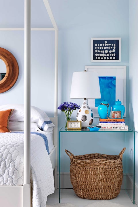
Not only is light blue paint calming, but it also acts as a neutral when you choose light shades.
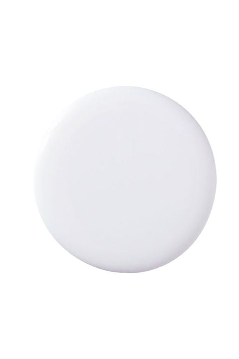
“This icy blue has a cool crispness that’s refreshing. I’d add fabrics in different tones of the same shade, like navy and slate, to create a layered, monochromatic look. Or you could bring in contrasting colors, like brown and red. The warmth and coziness of all the textures and tones make the room easy to be in,” says designer Robert Stilin.
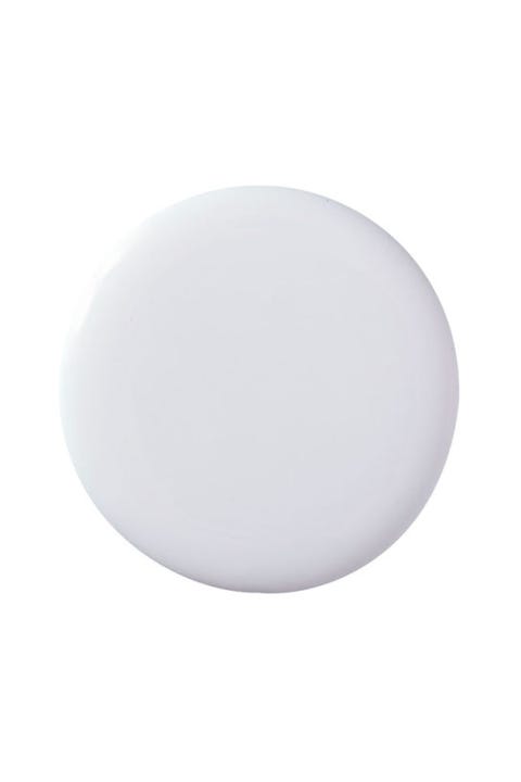
“There’s a kind of clarity in the air after a rain, and this color has the same feeling. It suddenly makes the ceiling of a room seem taller, and the space somehow becomes larger. It totally changes the room’s energy and makes you feel like you can finally take a big, deep breath!” says designer Katie Maine.

“This has the coolness of a long, tall drink of water on a hot day. I use it frequently for ceilings because it’s subtle. It catches your eye but doesn’t yell. Or, if you want to dazzle, do it in high gloss on the walls, and the space will be electrified!” says designer James Howard.

“When you think of the color of a lake, you have to think about trees and shadows and clouds. It’s muddled, like this gray-blue. It’s not a clear jewel tone, like the ocean. The ocean, with its breaking waves, is all about energy. Lake water is more soothing. It laps at the shore. This gray-blue kind of washes over a room, and you don’t see the clutter,” says designer Susan Ferrier.

“Some people would call this pale gray, but it actually has blue and purple in it. To me, it’s the color of the fog out here in Seattle. I used it in a living room with massive windows overlooking the Pacific Ocean, and at certain times of the day, you couldn’t tell the difference between the sea and the sky and the walls. They were all the same color,” says designer Brian Paquette.
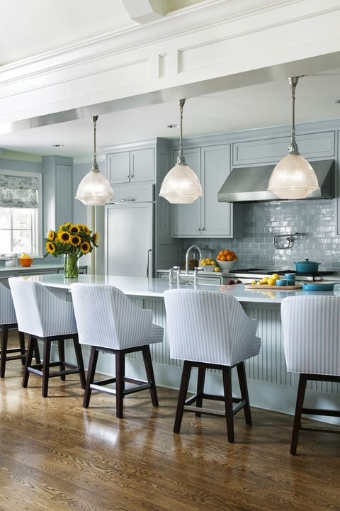
Whether it’s a soothing sky or vibrant turquoise, these blues hit the sweet spot between subtle backdrop and intense color.
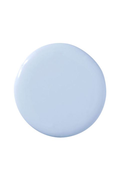
“I used this in the study of a Manhattan apartment with panoramic views out to the Hudson River. It blurred the edges of the walls and seemed as if the sky was lulled inside to wrap the room in one fell swoop. And the blue of the sky was reflected in the river. Spike it with shades of green, inspired by the treetops and lots of white,” says designer Raji Radhakrishnan.

“This is a romantic and charming blue with soft undertones of gray. For me, it embodies Paris in the rain — the silvery reflections on the streets, the misty sky, the coat-grabbing wind. It’s a very soothing color, so I see it in either a bedroom or a breakfast room. Pair it with yellows and oranges to make the blue look even richer,” says designer Ryan Saghian.

“Aqua is a calming color, which balances a fiery red-head like myself and makes for a pretty room. Actually, most people look good in aqua, and when you look good, you feel more confident. I often like to use a range of one color, so I might add a darker teal or Prussian blue. Red or pink would punch it up and give it more pizzazz,” says designer Lindsey Coral Harper.

“On vacation in the Caribbean islands, I was walking along a street and stopped to sit on a ledge so I could look down at the water, which was exactly this color. And suddenly, just three feet away, all these tropical fish were swimming by in the most amazing purples, yellows and greens. We humans can make many beautiful things, but nothing is more beautiful than what’s already here in nature,” says designer Erinn Valencich.
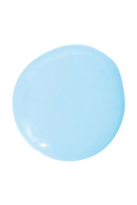
“I like real colors, as opposed to those that are just a hint of something. I love clarity, and this is a clear blue. Anything you put against it — a black bamboo bed, a bright abstract painting — will pop. And the light in the room takes on a wonderful atmospheric quality. You feel good in it,” says designer Harry Heissmann.
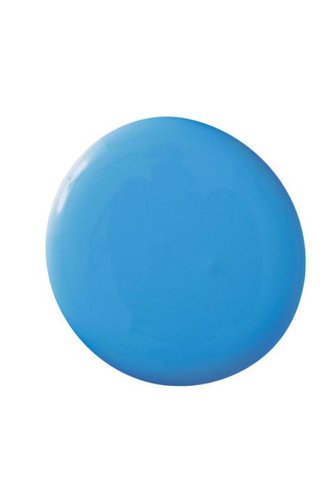
“Certain shades of blue immediately take me away to a tropical island, and this is one of them. Even though it’s a medium-bright tone, it’s still calming, yet vibrant enough to make me feel happy as soon as I enter the room. Add accents of tangerine and lime green to enhance the tropical flavor,” says designer Debbie Viola.

You might shy away from bold, dark blues, but this room is proof that a rich blue is possible. Navy, teal, cerulean—the more saturated, the better.

“This painterly blue proves a color can be tranquil and exciting at the same time. You almost sink into the calmness, but it’s still confident,” says designer Mary Douglas Drysdale.

“I’m a big blue-and-white freak. It says nautical, crisp and timeless to me. I painted my kitchen cabinets this great blue — almost a navy but with some periwinkle thrown in — and did white statuary marble on the counter tops,” says designer Dan Barsanti
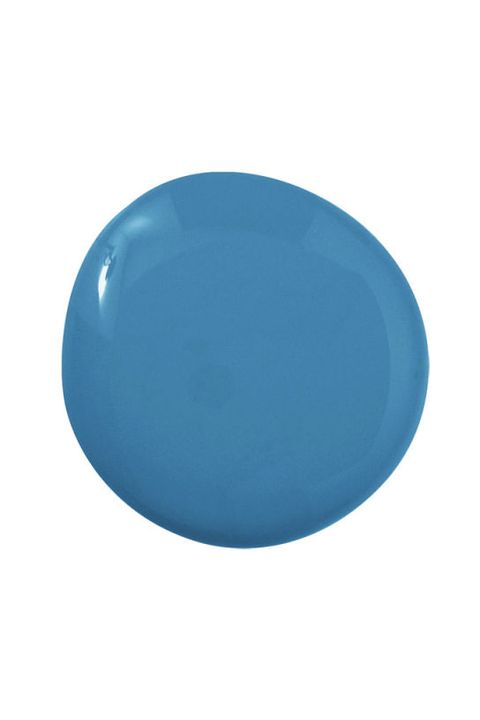
“In Turkey, the sea is so clear and so bright — a true ocean blue, like this color. You see the same blue in the tiles in the Blue Mosque. It has endless depth, and that makes it very calming. I’m imagining it in a high-gloss finish in an entry or a library. After all, it’s only paint. Take a risk and go for it!” says designer David Phoenix.

“This is the deep, almost Prussian blue of the ocean in the Bahamas at low tide, and when you combine it with coral-colored fabrics, it’s amazing. It vibrates in a wonderful way. I’ve also used it in a bedroom with blue-and-white toile. If you’re doing a home anywhere near the sea or you simply want to remember the sea, this is the color to go with,” says designer Alessandra Branca.

“A deep, dark blue in a dining room will evoke the deep, dark Atlantic. The paint finish is matte to absorb as much light as possible and let the objects arranged on it shine,” says designer Tom Scheerer.

“In the full-gloss finish, it catches the light, which brings out the vibrancy of the color,” says designer Elizabeth Dinkel.
Original Source:
BY CHRISTINE PITTEL AND SIENNA FANTOZZI
https://www.housebeautiful.com/room-decorating/colors/g2162/best-blue-paint-colors/